When we lived in Pennsylvania, our yard was home to a Beauty Bush. Now I visit the ones in our neighborhood. When they burst into bloom, there are not enough names for the number of shades of pink that share space on each branch. Unlike last week's post, color is important in this photo. As with my previous photo, the strong verticals and even spacing of a fence are an important part of the composition. But the curve of the branch and the soft shades of pink work together to make this photo seem very feminine. This photo makes me think of the ideal garden many of us dream about, and a perfect spring day.
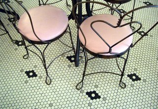
 Cincinnati has two world-class family-run ice cream companies, Graeter's and Aglamesis Brothers. Those of us who grew up there are happy to engage in enthusiastic arguments over which is better, especially if a side-by-side comparison tasting can be arranged. But for ambiance, Aglamesis wins hands down. While the hot-air balloon wallpaper of my childhood is gone, the pressed tin ceiling, glass cases full of chocolates, round marble tables and tulip-shaped lamps all remain. Burly guys balance themselves on the wrought-iron chairs with their heart-shaped backs, digging into banana splits. I love the interplay of black lines against black and white tile in this photo. The circles of pink give some solidity to all the lines. Whenever I see this color combination, it sets off a Pavlovian response that results in the urge to consume ice cream.


